How do I access and use quadrant reporting?
Last updated: September 25, 2025
Quadrant Reporting
Quadrant Overview
The quadrant reporting feature takes the guesswork out of productivity measures.
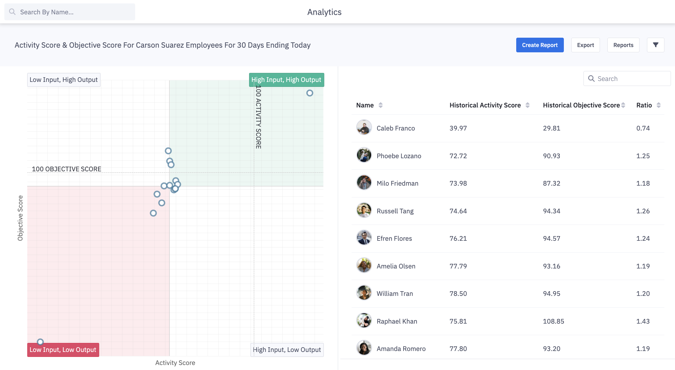
On the quadrant, you can see a productivity ratio comprised of Activity and Objective Scores or any other two metrics chosen for the x and y-axis. The center is the median of each axis’ values, which designates the red & green areas of the graph.
Each point on the quadrant represents a user, team, role, etc. When a point is clicked on you will be able to see: the entities name, x axis metric value, y axis metric value, and productivity ratio.
Based on where a user, team, or role is displayed in the quadrant, you can have the appropriate game changing or encouraging conversation that needs to happen.
Access Quadrant Reporting
Users with the permission "Analytics Reporting: View" will be able to view all analytics data aside from saved reports created by others that are not explicitly shared with them.
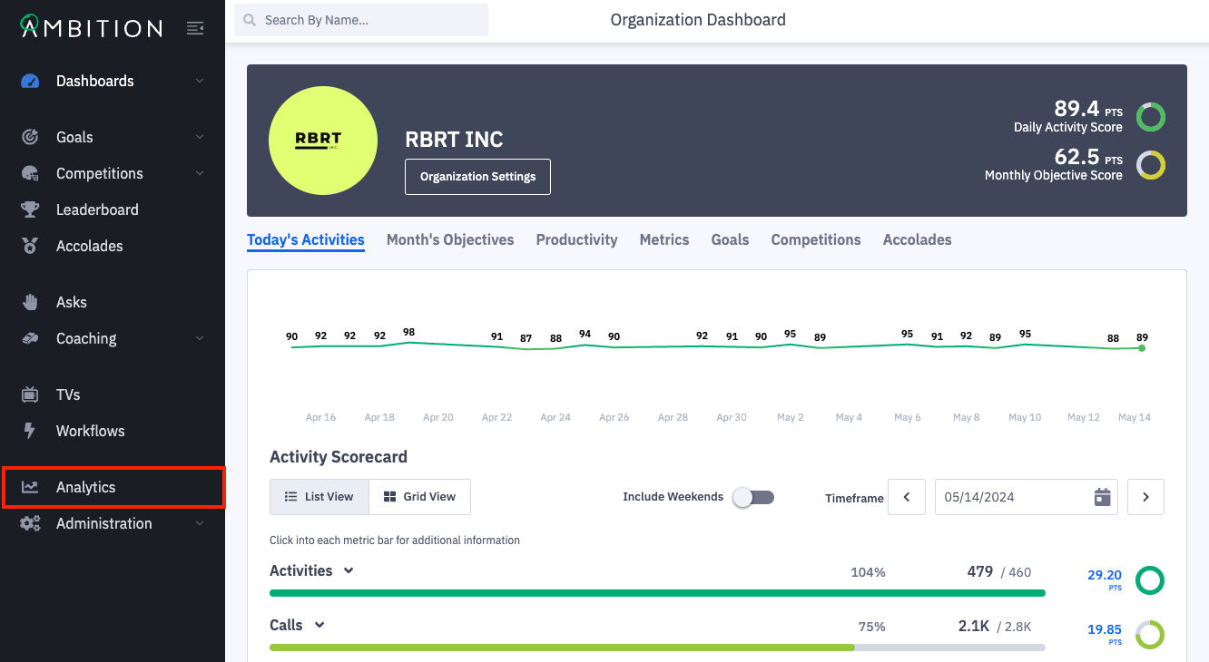
1. Open the left navigation and click Analytics.
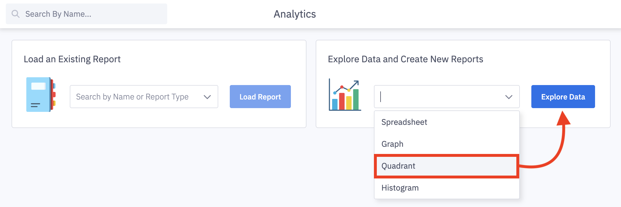
2. From the analytics' home page, you can open any previously saved reports or open a new report type.
Select Quadrant from the Explore Data and Create New Reports dropdown menu and click Explore Data.
3. A preset quadrant will load for the length of your organization's Objective Score, showing the Activity Score, Objective Score, and Productivity Ratio for all employees in Ambition.
If your organization does not use both Activity and Objective Score, a "Start by selecting your Metrics" message will be shown upon loading.
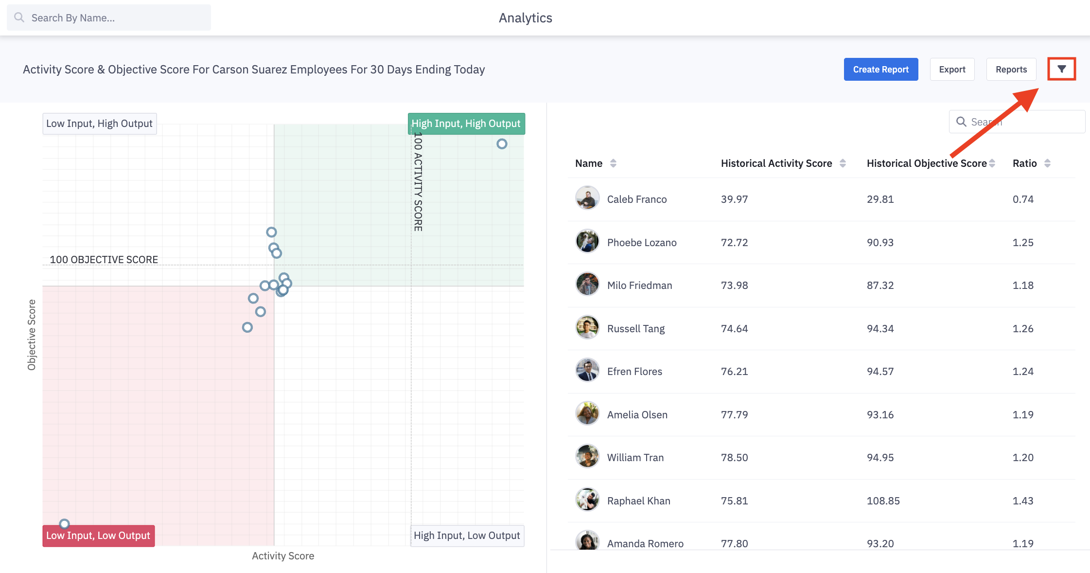
4. Click the filters icon to slide out the filter panel, allowing you to have drill-down capabilities to capture the exact data, metrics, time frame, and hierarchy levels you are desiring to see.
X-Axis and Y-Axis Metrics
5. Metric selection (X and Y-axis)
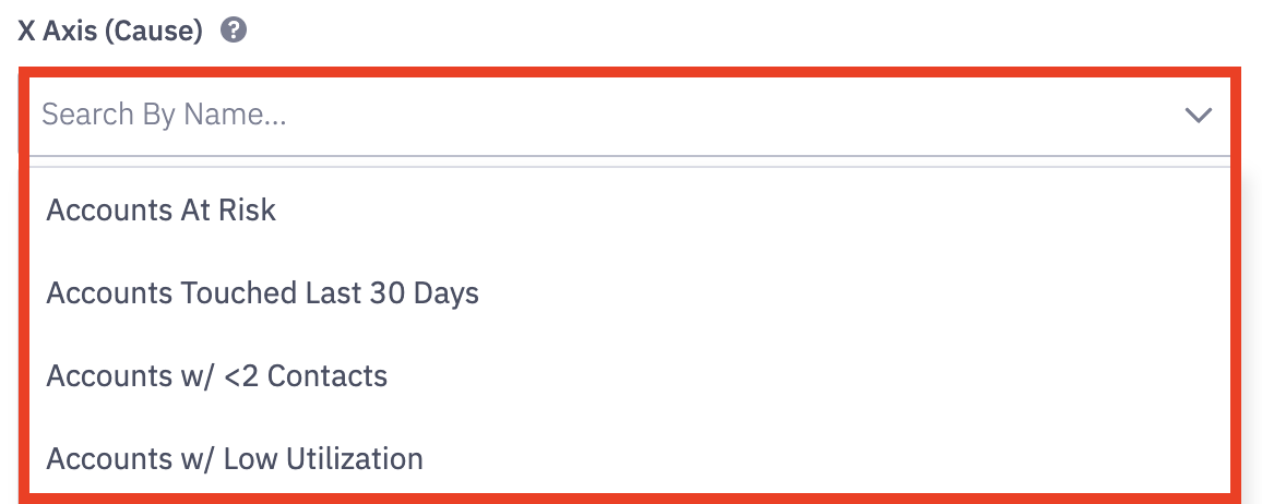
Search by name or scroll to update the metrics used for both the x-axis and y-axis. Click on a metric to select.
X-axis = Cause
Y-axis = Effect
Timeframe
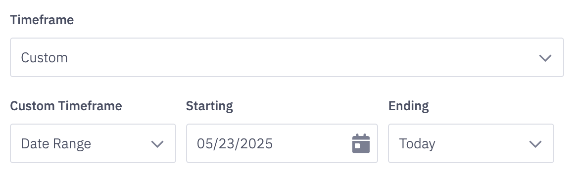
6. Timeframe for both X and Y-Axis.
Note: UTC is used as the time standard when using time frame selections. To view data in your respective time zone or across several time zones, we recommend using the "Custom" option.
Timeframe options include:
Custom*
Today
Yesterday
Last 7 Days
Last 30 Days
Last 90 Days
This Week
Last Week
This Month
Last Month
This Quarter
Last Quarter
This Year
Last Year
*Selecting Custom -> Date Range will allow you to choose a specific date range through a calendar picker. A custom end date can be selected as well.
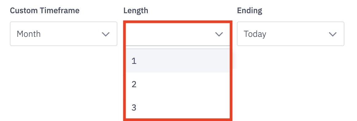
At the current time, the custom time frame option can display data for a time range of up to 3 years. ex. January 1st, 2020- January 1st, 2023.
If you select "custom" as the timeframe, select the custom time frame - day, week, month, quarter, or year - and also select the length of time you'd wish to view.
Select between 1-100 units of time.
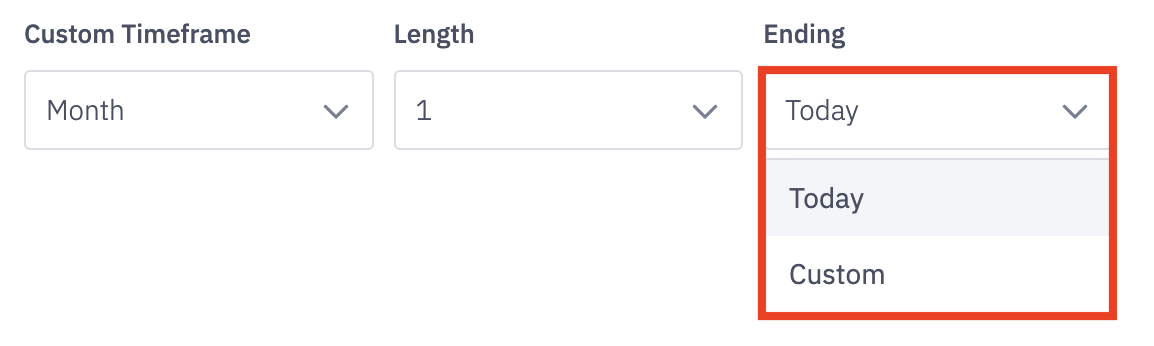
Determine the end range of your data set by selecting either today or a custom ending time.
*Selecting Custom will allow you to choose a specific end date through a calendar picker.
Hierarchy Level
7. Hierarchy Level
Select the appropriate hierarchy level for the data you are looking to analyze.
Read more about Ambition Hierarchy Levels here.
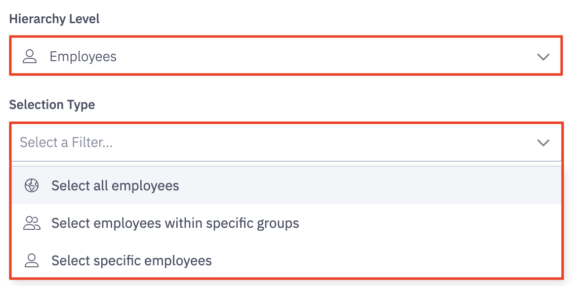
Hierarchy Level is the level of employee, team, role, etc that you wish to view their data.
Do I want to view data for employees? Do I need data for all of my teams?
Selection Type will display options of All, Within Specific Groups (if employee was selected), and Specific Employee or Group.
Is this data for Employees > All? Employees > Within > BDR Role? Employees > Custom > Joe Smith?
Special Note when using the Employee > Within > "Manager" or the "Manager" Hierarchy Level in cases where a manager manages other managers.
If Manager A is listed as a Manager B's manager within their user settings, any of Manager B's direct reports will also be considered as users Manager A manages, or Manager A's subordinates.
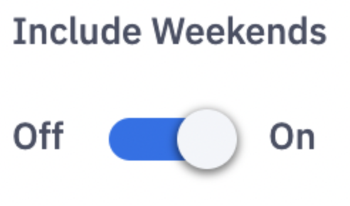
Include Weekends
8. Include or exclude weekends in your data through the Include Weekends toggle.
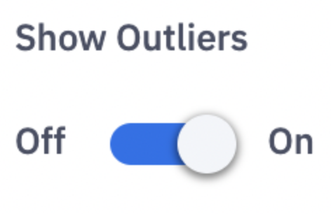
Show Outliers
9. Include or exclude outliers in your data through the Show Outliers toggle.
Apply Filters
10. Click Apply Filters to update the quadrant with your filter changes. Applying filters will reload your quadrant report with the newly selected filters.

How do I use the Quadrant
Input? Output? What Am I Seeing?
The quadrant is, by default, based on the cross section of Activity Scores vs Objective Scores.
The level of input is based on activity scores. What level of work is a user inputting on a daily or weekly basis?
The level of output is based on objective scores. What level of output is a user generating on a weekly, monthly, or quarterly basis?
High Input, High Output
Average Daily Activity Score: 98
Monthly Objective Score: 94
These folks deserve a high five, a shoutout, a congratulations from their manager. Let them know you recognize their hustle.
"Great job this month!"
Low Input, Low Output
Average Daily Activity Score: 23
Monthly Objective Score: 22
These users need some long term strategies. This is not a one and done fix, but a chance to work on the whole process.
Set a goal first thing. Pick a metric on the front end of the sales process.
Once that goal is met and exceeded, create a new goal further in the sales process.
"Alright, well you didn't hit any of your goals which makes sense since little activity was completed. Let's address your lack of motivation and have an honest conversation as to whether you fit into the role."
High Input, Low Output
Average Daily Activity Score: 104
Monthly Objective Score: 19
Lots of work is being done without much payoff. Let's change that and move these users into the "high input, high output".
Find where the gap in process is occurring. Present an area that can help fill the gap and turn out results. "If you do five times more of X, this is what your bonus could look like."
If the high input with no results continues, these users can easily burn out and shift to the left in the quadrant.
The drive is there. Let's focus on turning that work into results.
"I love the effort, now let's work together to see results. Let's setup time next week for me to shadow some calls and appointments."
Low Input, High Output
Average Daily Activity Score: 31
Monthly Objective Score: 123
First, make sure users are correctly logging their activity. If logging is correct and you want more revenue, these are the users to motivate!
For little input they have achieved high output, which makes you wonder what's their true potential if motivated to step up their input.
It may be these users send captivating emails or are magic at converting leads. No matter the reason, finding out what they are doing to achieve high output can only help your organization.
"Great job as your numbers are outstanding. I'm curious, would you mind helping me understand your low activity score? Maybe you forgot to log some things, or maybe your process involves tasks we are not currently measuring/scoring but should be?"