How do I access and use graph reporting?
Last updated: June 18, 2025
Graph Reporting
Graph Overview
Graph reporting allows you to view trends over specific periods of time.
Trends are powerful. Trends highlight patterns. Positive trends can be reinforced, while negative trends can be realigned. You can't do either of these if you are not aware of the trends of your users.
Sorting by time frames and metrics, you can analyze trends for the users you manage as a whole while also being able to drill down to the individual level.
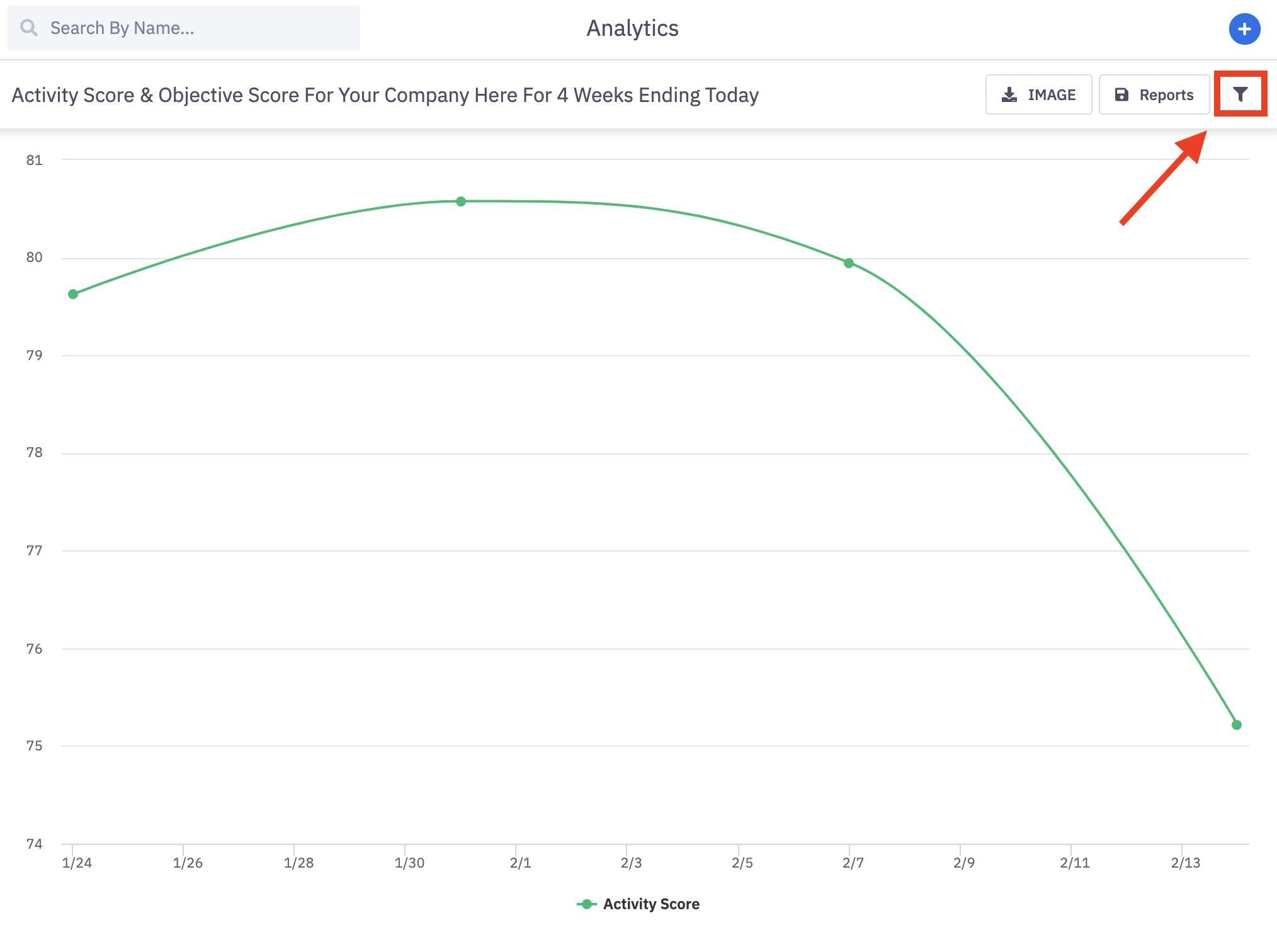
Access Graph Reporting
Users with the permission "Analytics Reporting: View" will be able to view all analytics data aside from saved reports created by others that are not explicitly shared with them.
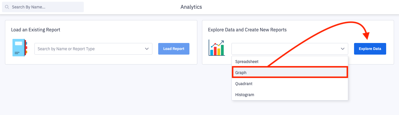
1. Open the left navigation and click Analytics.
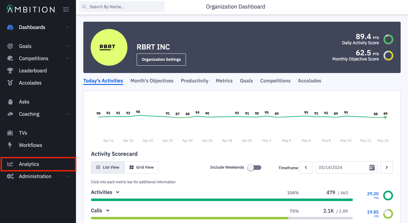
2. From the analytics' home page, you can open any previously saved reports or open a new report type.
Select Graph from the Explore Data and Create New Reports dropdown and click Explore Data.
If your organization does not use both Activity and Objective Score, a "No Data" message will render upon loading. Adjusting the filters in the next step will resolve the no data message!
3. Click the filters icon to slide out the filter panel, allowing you to have drill-down capabilities to capture the exact Data, Metrics, Time Frame, and Hierarchy Levels you are desiring to see.
Display As
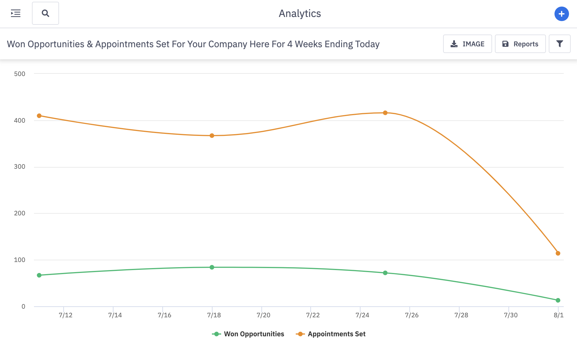
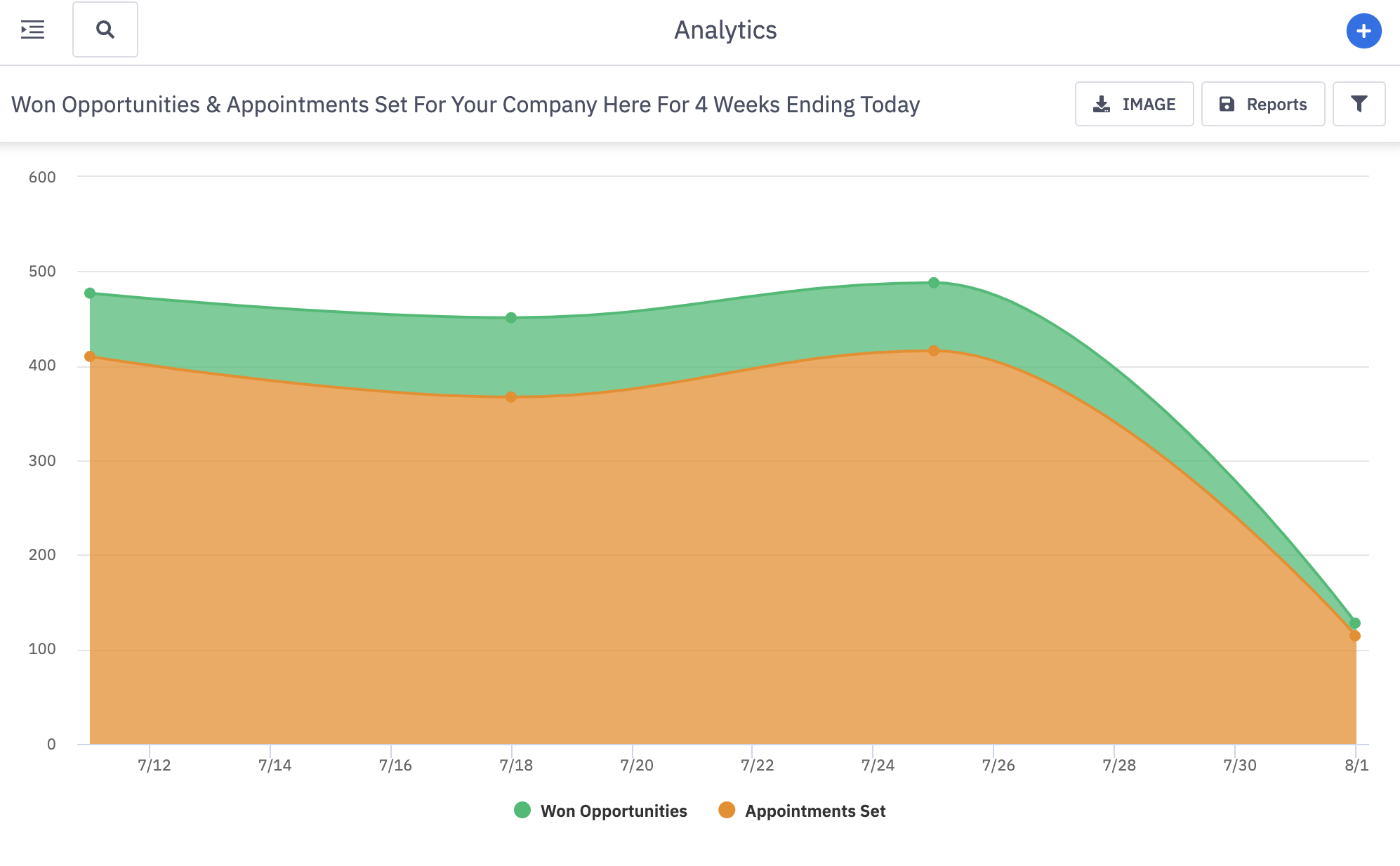
4. Select the Display As filter to view your data across three different graph types:
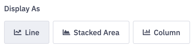
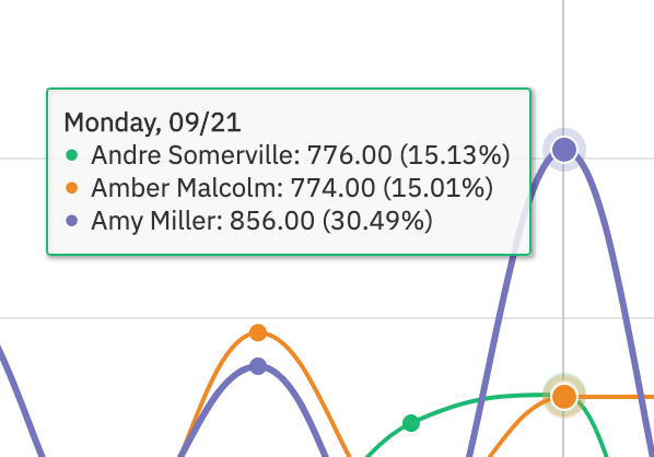
Line Graph - Great for viewing trends over time.
Stacked Area Graph - Perfect for comparing part-to-whole relationships (ex: Meetings Set - Outbound with Meetings Set - Referral).
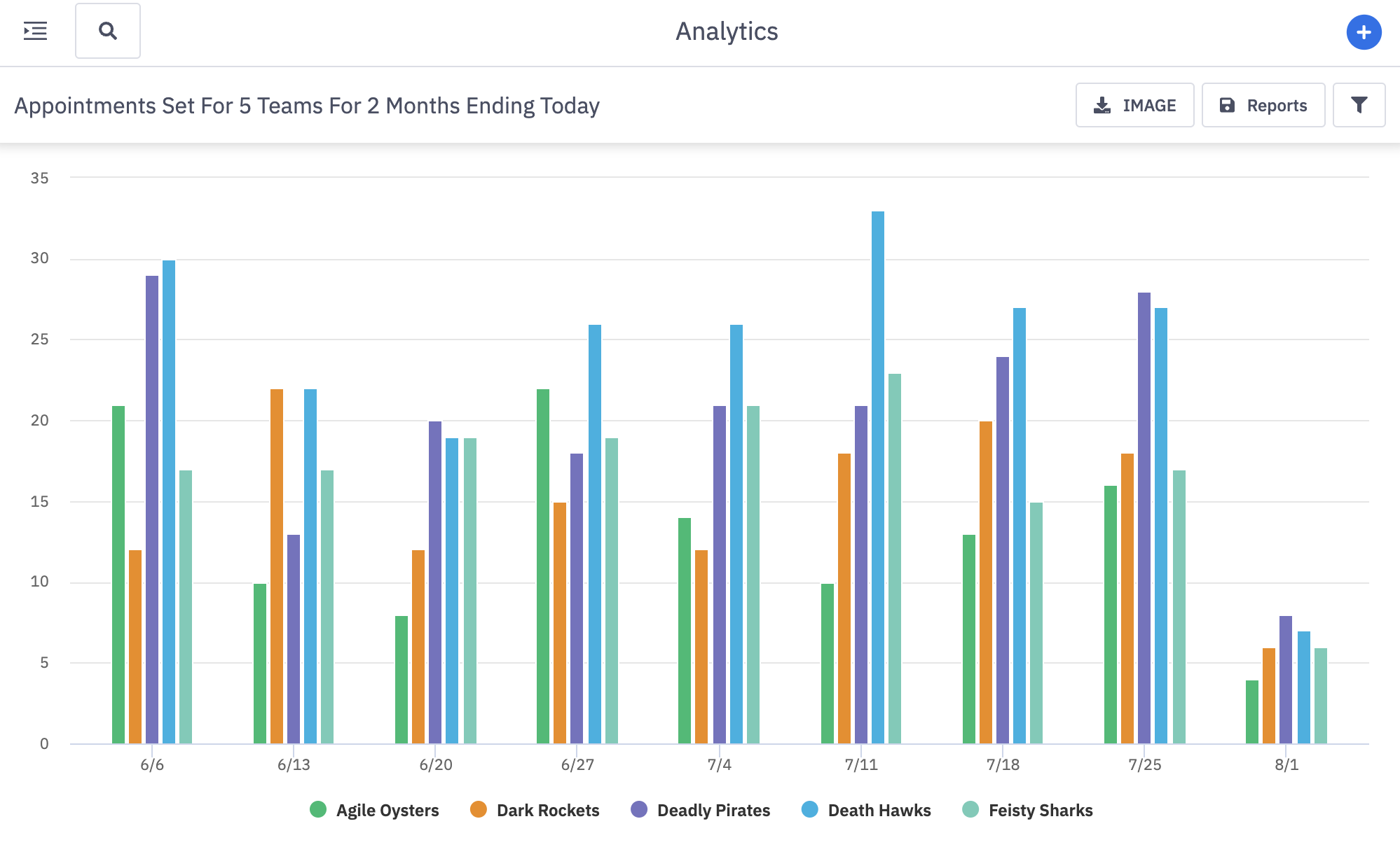
Column (Bar) Graph - Great for comparing teams across a single metric.
5. Customize the timeframe and series that you wish to view data across.
Timeframe
a. Select the Timeframe that you are wanting to view data across.
Note: UTC is used as the time standard when using time frame selections. To view data in your respective time zone or across several time zones, we recommend using the "Custom" option.
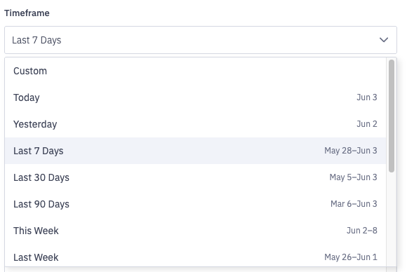
Timeframe options include:
Custom*
Today
Yesterday
Last 7 Days
Last 30 Days
Last 90 Days
This Week
Last Week
This Month
Last Month
This Quarter
Last Quarter
This Year
Last Year
*Selecting Custom -> Date range will allow you to choose a specific date range through a calendar picker. A custom end date can be selected as well.
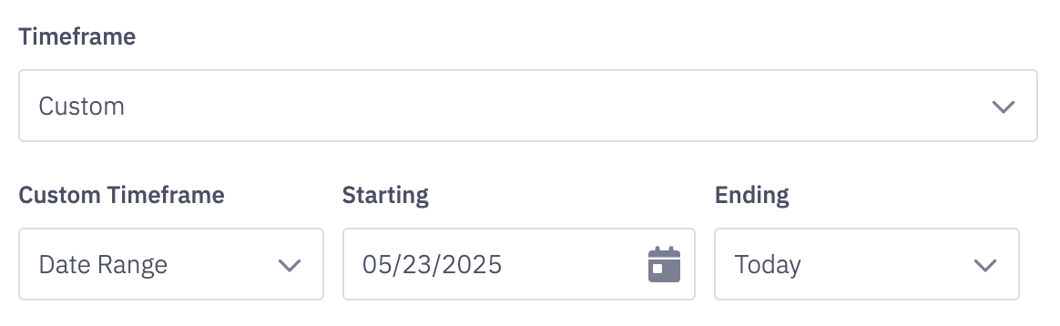
At the current time, the custom time frame option can display data for a time range of up to 3 years. ex. January 1st, 2020- January 1st, 2023.
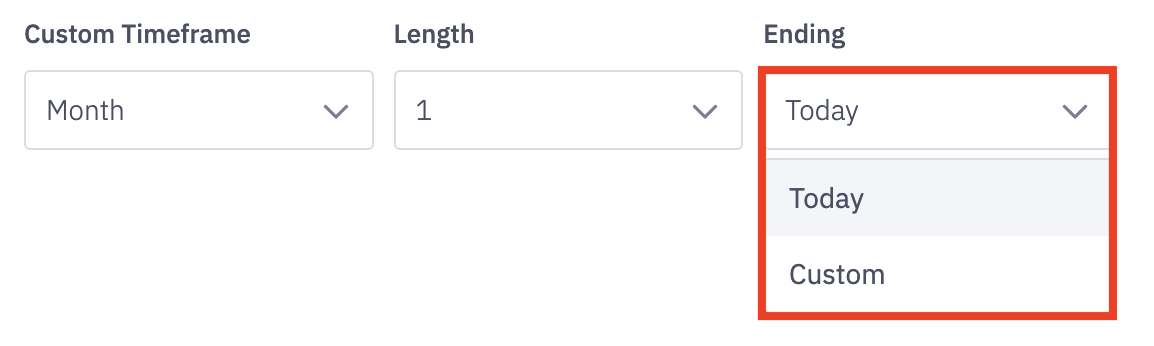
If you select "custom" as the timeframe, select the custom time frame - day, week, month, quarter, or year - and also select the length of time you'd wish to view.
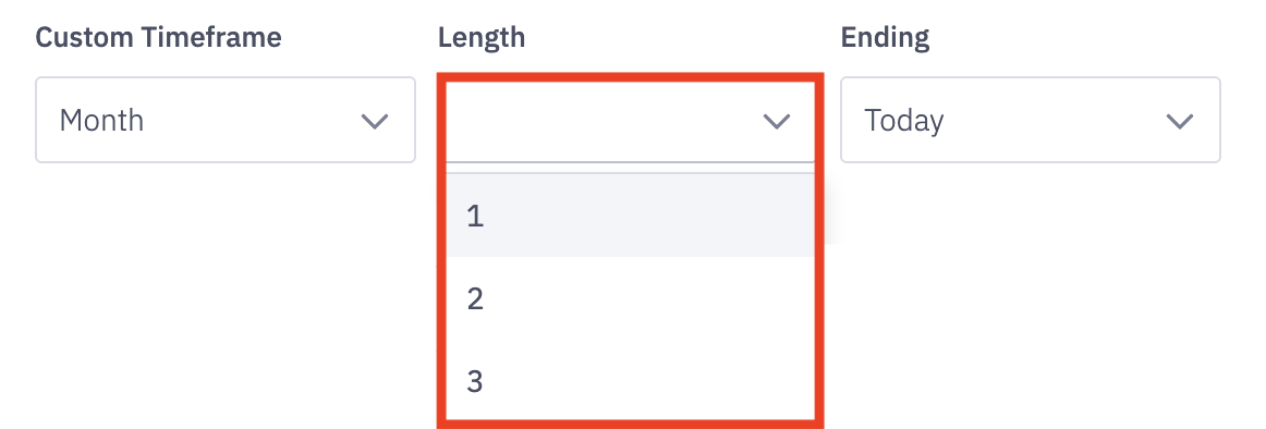
Determine the end range of your data set by selecting either today or a custom ending time.
*Selecting Custom will allow you to choose a specific end date through a calendar picker.
Time Series
b. Decide the intervals that you wish to see your data by selecting either day, week, month, or quarter. This will be your x-axis on your graph!
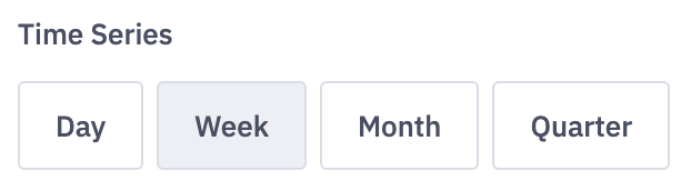
Example X-Axis from selected time series above. 4 months broken down by week.

Note: Choosing a time series that's larger than the timeframe will result in a single data point on your graph.
Example: Timeframe = 1 Month ending Today, Time Series = Quarter will render a single data point instead of a line or stacked area graph and a single bar for a column graph.
When viewing the Objective Score metric, ensure that the time series is equivalent or greater than the organization's Objective Score time frame (ex: weekly, monthly, or quarterly).
Metric
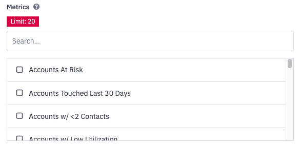
6. Select the metric you wish to analyze by clicking the dropdown under metric. You have the ability to select up to 20 metrics at once.
You can either view 20 metrics at once for 1 user/group/manager, or 20 users/group/managers at once for 1 metric.
Hierarchy Level
7. Select the appropriate hierarchy level for the data you are looking to analyze.
Learn more about hierarchy levels here.
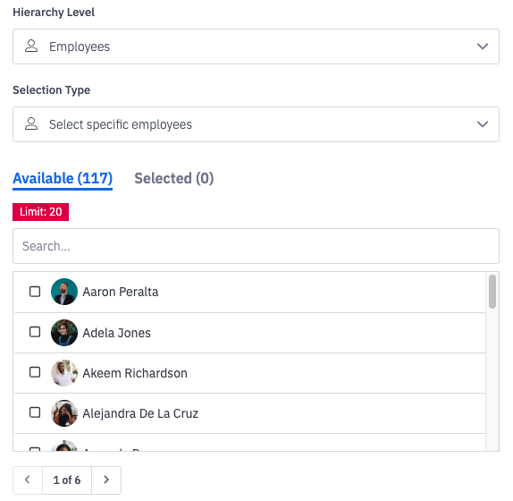
Hierarchy Level - select the group type you wish to view graph reporting for
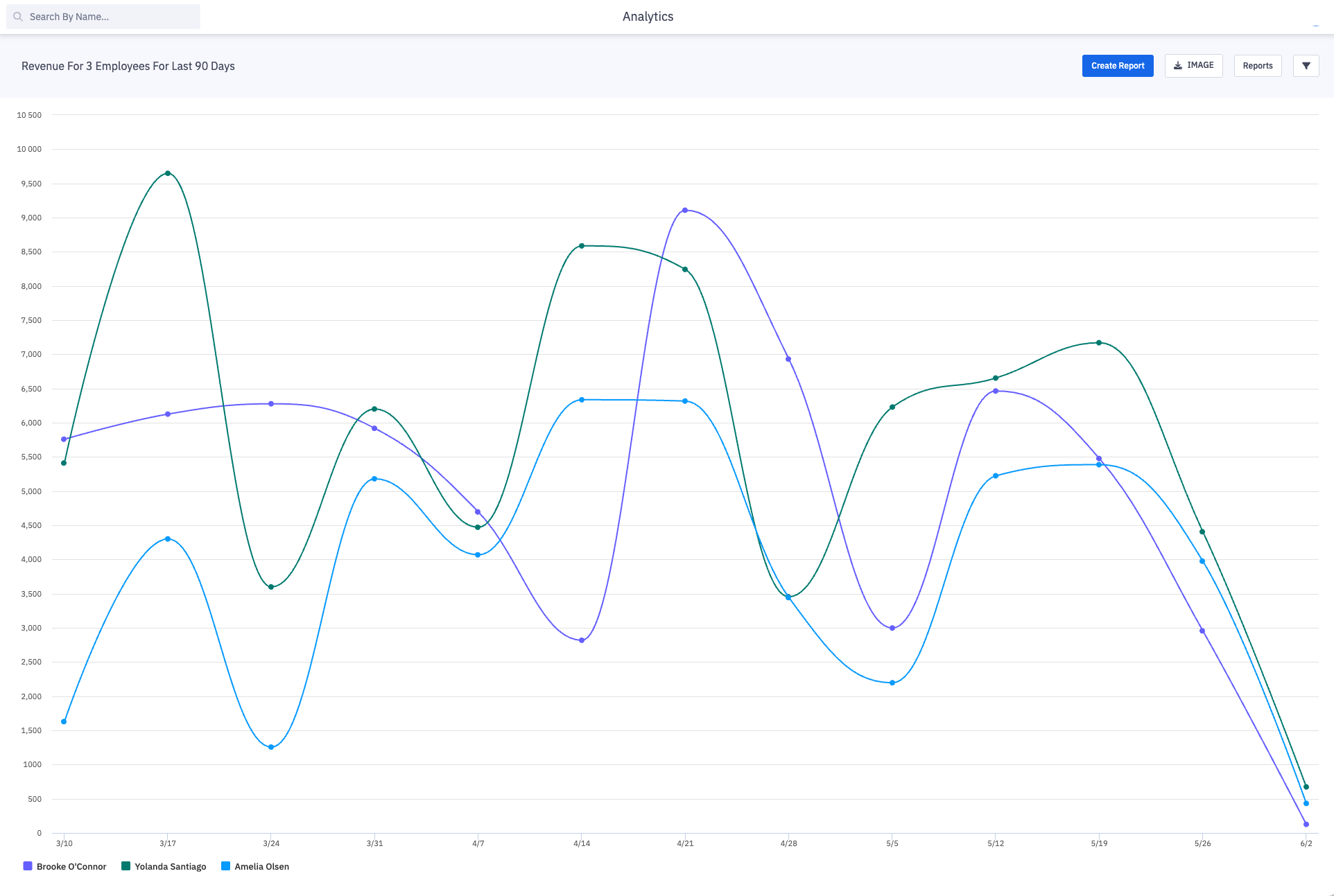
Do I want to compare data for 3 employees? Do I need data for just one team?
Selection Type will only display "select specific".
Graph Mode will allow you to select up to 20 users or groups to display.
You can either view 20metrics at once for 1 user/group/manager, or 20 users/group/managers at once for 1 metric.
Special Note about selecting the "Manager" Hierarchy Level In Cases where a Manager Manages other Managers.
If Manager A is listed as a Manager B's manager within their User Settings, any of Manager B's direct reports will also be considered as users Manager A manages, or Manager A's subordinates.
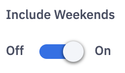
Include Weekends
8. Include or exclude weekends in your data through the Include Weekends toggle.
Show Percent Changed (line graph)
9. If line is selected as the "Display As" option from Step 5, you'll have an additional toggle of Show Percent Changed.
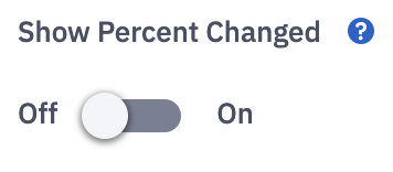
The % to change will appear in parentheses next to the value.
Apply Filters
10. Select the Apply Filters button to update the graph reporting with your filter changes. Applying filters will reload your graph report with the newly selected filters.